In the comments this morning, Ken asked about painting Union blue coats. It's tough to make Union figures pop, I'll admit. Although I think the Civil War uniform is probably the best looking uniform the US army has ever worn, it isn't the sort of thing to jump off a miniature wargame table.
The reason it's so hard to make these uniforms pop is that the Union coat was very, very dark. Here's a four button sack coat from a reenactors' supplier. The color is a very dark blue, almost indigo. In fact, if you look at the raised areas of the jacket, you can see a purple sheen.

So how do you reproduce this on the tabletop? Well, you really don't. If you used the actual colors, your figures would look to be dressed in black. That's entirely accurate, by the way. I've read a number of Confederate accounts where they mention that the Union uniforms were so dark, they looked black from a distance. But you don't really want that for your wargames, do you?
Because our miniatures are so small, most people actually brighten the colors a few shades when they paint. Think of all the bright blue coats you've seen on Napoleonic French infantry, for example. Here's a reproduction French coat, and the blue is even darker than Union blue.

So with that in mind, here's how I paint Union blue. I don't claim that this is the only way, or even the best way. As I've just written, I'm not even trying to get an exact color match. I'm trying to suggest a dark blue while actually painting pretty vibrant blue.

The jackets and hats get an initial coat of Delta Ceramcoat "navy blue." That acts as my shade color. My main color is a mix of "navy blue" and "liberty blue." I wish I could tell you the ratio I use, but I really don't know it. I just mix until it looks right. I pick out all but the recessed areas with this medium blue mix. Finally I apply a very sparing coat of highlight, which is straight liberty blue.


Between their straps, belts, haversacks, knapsacks, bayonet scabbards, cartridge boxes, cap pouches, cap brims, and shoes, Union soldiers have a lot of black leather on them. That much black can make the figures appear awfully flat and lifeless. Before I paint anything else, I use "toffee brown" to give the entire figure a light drybrush. This really helps the leather to pop, and it's pretty realistic as well. After all, the leather was merely painted black. Any raised areas were sure to have some paint wear off, exposing the natural leather underneath.

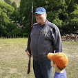
Here are two extreme closeups so you can really see my technique on the blue. It looks like a very light blue in these two pictures, but that's a little deceptive. The blue mellows more with a little distance.


Scott,
ReplyDeleteThat's an excellent turtorial. Thanks very much.
Ken
Great posting! Now, tell us what colors you use for the trousers.
ReplyDeleteThanks!
Nice-looking figures, and a fine tutorial.
ReplyDeleteJust as an aside, no one should ever see a purple sheen in a federal coat. That purple effect comes from sunlight as it fades the chemical dies used in low-quality reproductions. Period federal coats were never purple at any time. In fact, if you look at the threading of original coats, you'll be amazed at just how well they keep their color.
I recall a fellow who was a colonel with the recreated 6th OVI. The man absolutely refused to replace his uniform, believing that the ridiculous purple color he wore was comparable to authentic-looking wear and tear. He looked just like Barney the Dinosaur, or a grape. Horrible.